Probable Branding
Transparent
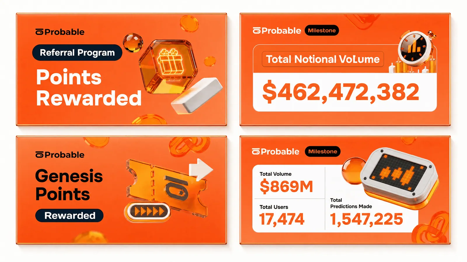
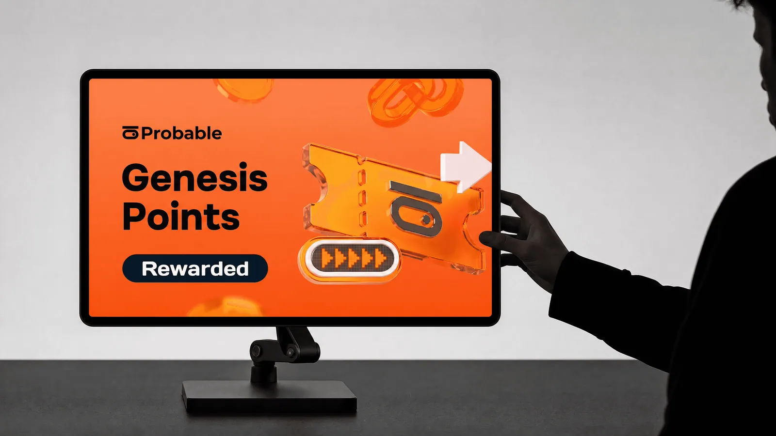
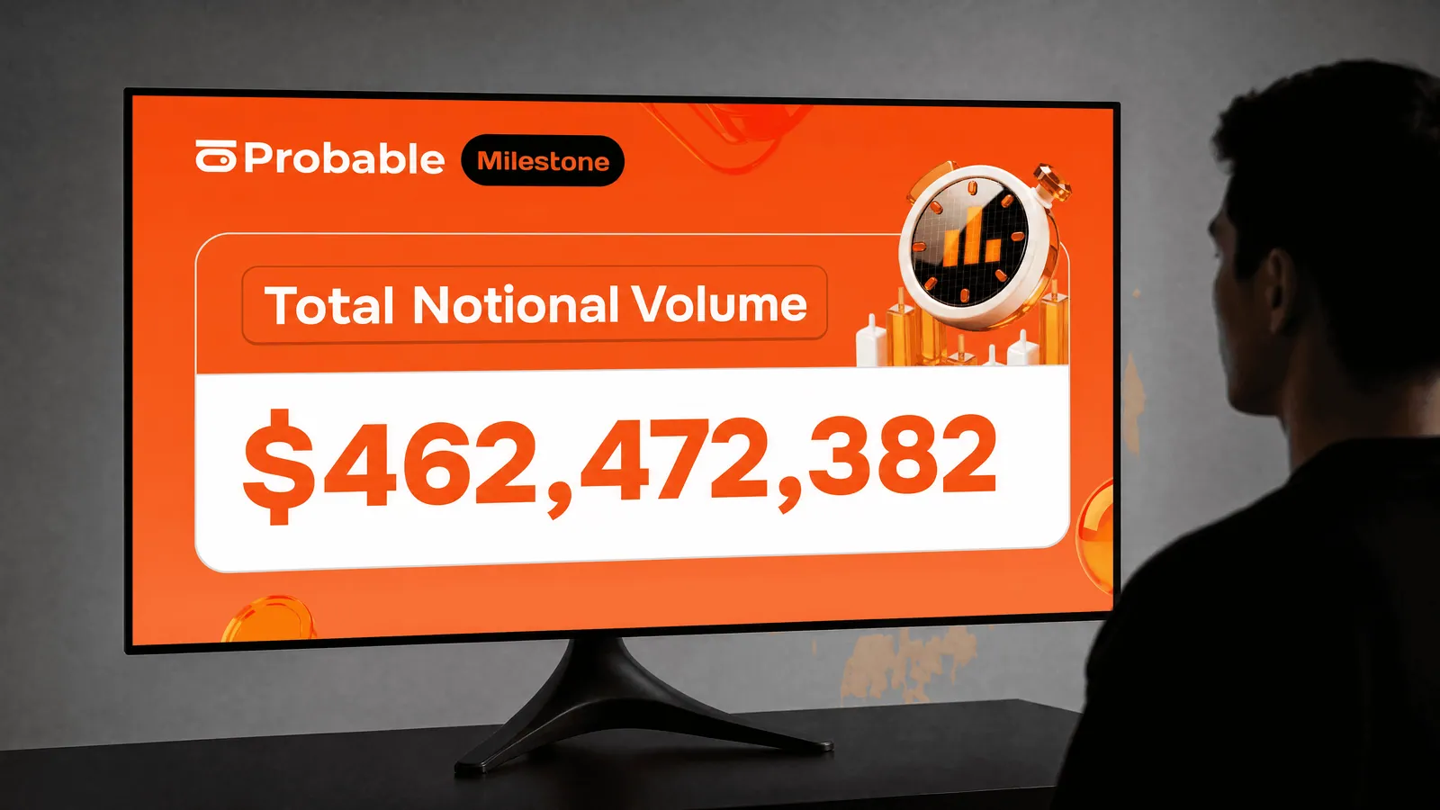
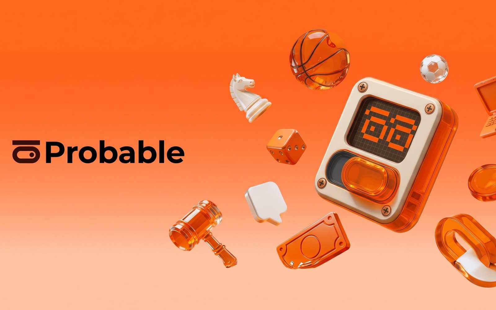
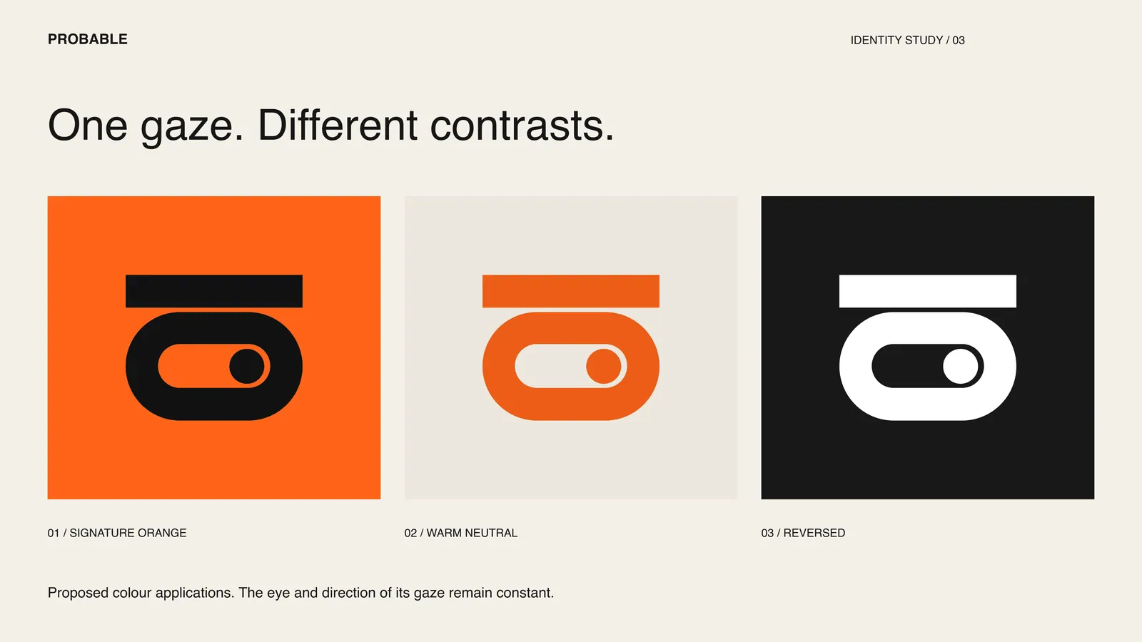
Translucent orange gives the identity its most distinctive quality. Light passes through the objects, revealing edges, layers, and depth. Against opaque ivory surfaces and dark displays, that transparency becomes more than an effect: it creates a contrast between what feels solid and what remains in motion. The identity carries across the logo, typography, layouts, and AI-generated 3D illustrations. Orange establishes recognition; dark surfaces give information a place to land; ivory provides a quieter counterweight. Within the campaign layouts, the illustration sets the tone while typography carries the message. That division gives each piece room to feel expressive without losing its focus.
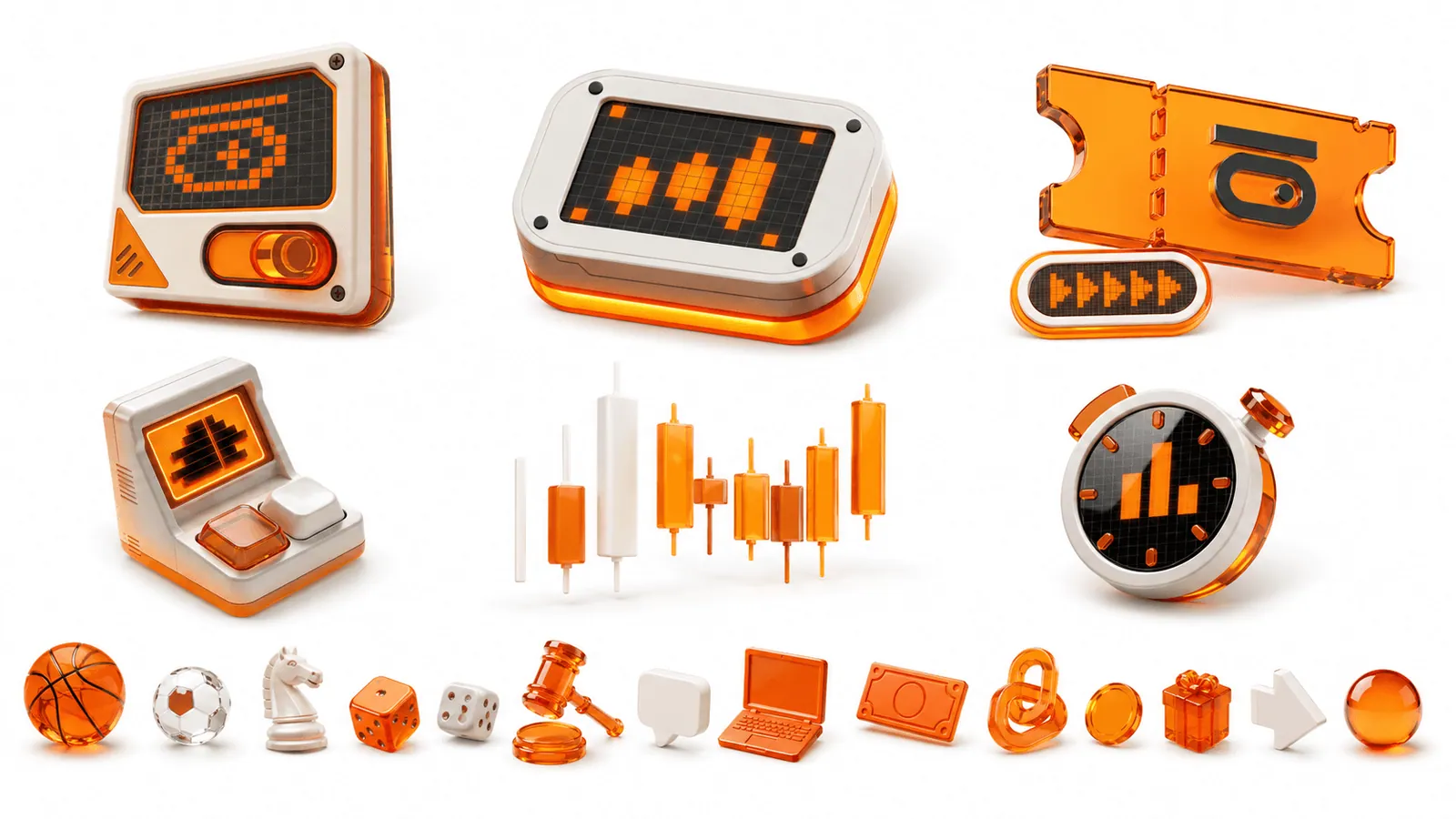

I created an AI visual workflow that could carry Probable’s visual language across new images while keeping the brand recognizable. At its centre was the translucent orange material: its luminous colour, visible depth, and relationship with light became the connecting thread between different objects and compositions.
The workflow gave the imagery a consistent visual foundation while allowing the subject to change. A ticket, a terminal, or a dial could each communicate a different idea and still feel part of the same world. This made the material a repeatable part of the identity, supporting an ongoing family of brand images beyond the initial set of illustrations.